Client
GIGY — SaaS Booking System for Telegram
Year
2025 - 2026
Timeline
1 year
Services
Product Design & Engineering
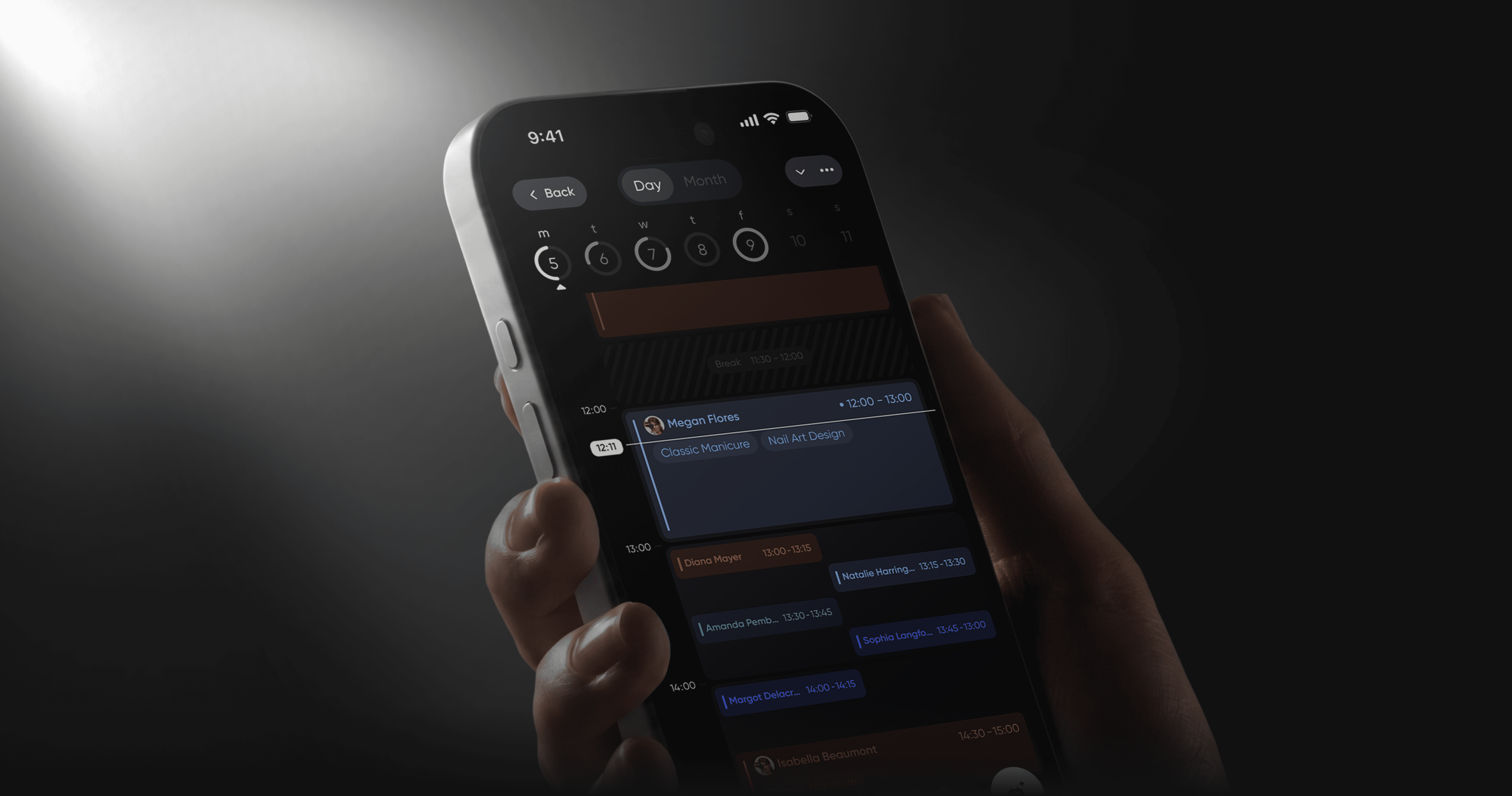
GIGY — SaaS booking system for beauty professionals. From 0 to 1.
Telegram app for self-employed masters and salons. 5 000+ active users, repeat payment conversion 67%.
Challenge
Problems & solutions
1
Problem
Early users didn't understand why they had to pay for an app when they could use a regular notepad. They left during the registration process. The problem, which seemed to be a UX one, turned out to be in the sales funnel.
1
Solution
I approached them through influencers. As soon as users saw the product through a trusted source, they began to understand its value and convert. Only then did the real UX problems become apparent.
2
Problem
Most similar apps are complex—users leave after signing up because they don't understand how to use them. There's no time to explain everything to everyone—the subscription is cheap, and the unit economics don't allow for it.
2
Solution
We removed registration entirely—Telegram already did it for us. We integrated onboarding into the product itself: as soon as the manager adds their first client, they intuitively go through the profile setup process. It's not a request to enter anything, but an action that automatically leads them forward.
3
Problem
The first design was universally appealing—too many niches, each with its own pain points. The designer would come in and find themselves lost in the product. It seemed like the problem was UX—in reality, the product was trying to speak to everyone and spoke to no one.
3
Solution
I decided to niche down. I created a narrow product for a specific professional, not for the entire beauty industry. This changed the product's positioning, onboarding, and communications.
Research
Research process
All competitors are making products for all professionals at once. That's why none of them truly work well for anyone. I took the opposite approach—I chose one niche and solved its problems completely.
Niche Research
I spoke with nail technicians, brow specialists, and lash artists separately. Each niche has its own pain points, its own language, its own workflows. A broad product doesn't solve them—it simply exists alongside them.
Competitor Analysis
I studied seven competitors and spoke with their actual users. The professionals explained why they continue to search for alternatives. All competitors are trying to cover the entire beauty market, but ultimately, they don't speak to anyone in particular.
Iterative Testing
Each solution was tested on professionals from the target niche, not on abstract users. Three onboarding iterations, two navigation options. The flow was considered complete only when the master completed it without a single question.
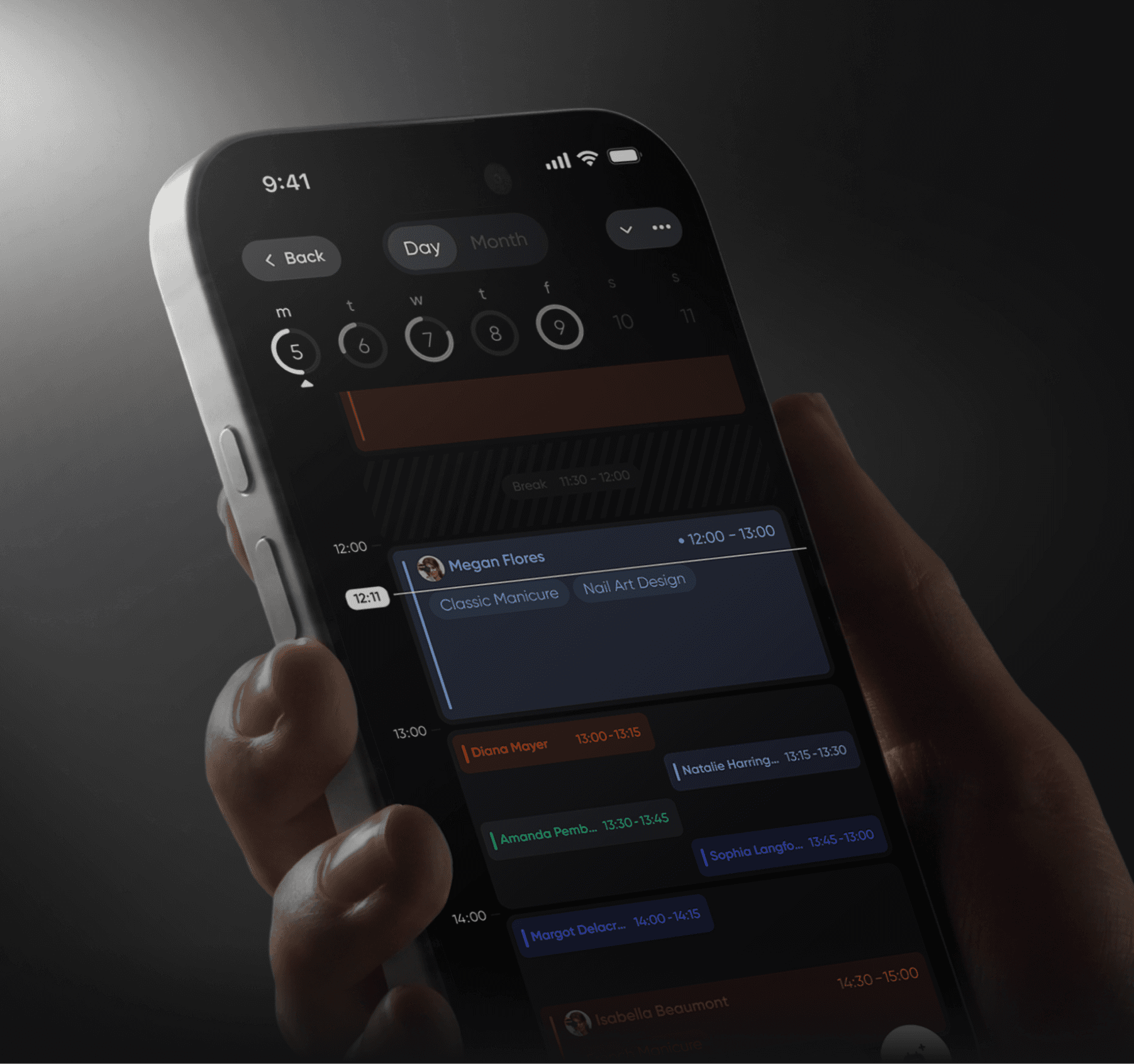
GIGY — SaaS booking system for beauty professionals. From 0 to 1.
Telegram app for self-employed masters and salons. 5 000+ active users, repeat payment conversion 67%.
Challenge
Problems & solutions
Problems & solutions
1
Problem
Each bank wants its own set of services - from operations to investments and insurance. How to create a system for quickly assembling an app for each bank's unique requirements while maintaining UX quality? Without flexibility, banks won't buy the product, but complex customization will slow down launch.
Early users didn't understand why they had to pay for an app when they could use a regular notepad. They left during the registration process. The problem, which seemed to be a UX one, turned out to be in the sales funnel.
1
Solution
Built a modular design system with ready-made solution blocks and components for each service. We select needed blocks (cards, transfers, investments) and quickly customize them to the bank's brand. Each block contains tested logic and UX patterns. The bank gets a ready app without designing from scratch.
I approached them through influencers. As soon as users saw the product through a trusted source, they began to understand its value and convert. Only then did the real UX problems become apparent.
2
Problem
Each bank has its own target audience by age - some work with youth, others with older clients, some with everyone. Young users want speed and modern interface, elderly want simplicity and clarity at each step. How to create one white-label solution that adapts to different age groups without redesigning?
Most similar apps are complex—users leave after signing up because they don't understand how to use them. There's no time to explain everything to everyone—the subscription is cheap, and the unit economics don't allow for it.
2
Solution
Each bank has its own target audience by age - some work with youth, others with older clients, some with everyone. Young users want speed and modern interface, elderly want simplicity and clarity at each step. How to create one white-label solution that adapts to different age groups without redesigning?
We removed registration entirely—Telegram already did it for us. We integrated onboarding into the product itself: as soon as the manager adds their first client, they intuitively go through the profile setup process. It's not a request to enter anything, but an action that automatically leads them forward.
3
Problem
White-label solution is sold to banks, not directly to end users. How to test app usability without access to real bank clients? Can't just release MVP and collect feedback - banks buy a ready product. UX errors will be discovered only after implementation, when fixes are expensive and time-consuming.
The first design was universally appealing—too many niches, each with its own pain points. The designer would come in and find themselves lost in the product. It seemed like the problem was UX—in reality, the product was trying to speak to everyone and spoke to no one.
3
Solution
Conducted testing at three levels. First - with bank employees who know client requests. Second - interviews with real clients of different banks, identified common problems. Third - focus group of different ages and audit by UX experts. This allowed testing the solution before implementation and avoiding expensive fixes.
I decided to niche down. I created a narrow product for a specific professional, not for the entire beauty industry. This changed the product's positioning, onboarding, and communications.
Второй баннер
Challenge
Challenge
Текст второго баннера на странице
Three problems that defined the entire product.
Research
Research process
Research process
Started by studying previous documentation - it described user problems and the history of all iterations.
Tracked changes in each iteration to understand which solutions worked and which didn't. This helped avoid repeating mistakes and build a redesign strategy based on real experience from previous versions.
All competitors are making products for all professionals at once. That's why none of them truly work well for anyone. I took the opposite approach—I chose one niche and solved its problems completely.
Product & Service Audit
Niche Research
Analyzed financial products of different banks - from basic operations to investments and insurance. Identified common patterns and unique requirements of each bank. This determined the architecture of the modular system.
I spoke with nail technicians, brow specialists, and lash artists separately. Each niche has its own pain points, its own language, its own workflows. A broad product doesn't solve them—it simply exists alongside them.
Product & Service Audit
Competitor Analysis
Tested the interface with users of different age groups (from 18 to 70+ years). Identified which patterns work universally and where adaptation is needed. Studied popular apps in the country to use familiar patterns.
I studied seven competitors and spoke with their actual users. The professionals explained why they continue to search for alternatives. All competitors are trying to cover the entire beauty market, but ultimately, they don't speak to anyone in particular.
Iterative Prototyping
Iterative Testing
Created a series of prototypes with different modularity approaches. Tested with business units of bank clients, demonstrated assembly speed for their requirements. Each iteration improved the balance between flexibility and implementation speed.
Each solution was tested on professionals from the target niche, not on abstract users. Three onboarding iterations, two navigation options. The flow was considered complete only when the master completed it without a single question.
Третий баннер
Challenge
Challenge
Текст третьего баннера на странице
Three problems that defined the entire product.
Шоурил
Showreel
Showreel
Текст для шоурила
Full flow — from adding a client to a complete schedule.
Создание записи
Booking Creation
Booking Creation
Показать полный флоу создания записи от начала до конца — быстро и без лишних шагов. Акцент на том что запись создаётся в минимальное количество касаний.
Competitors scatter the booking flow across tabs and settings. I brought everything into one card — client, service, discount, supplies, payment, comment. The master never leaves. The number of actions to create a booking dropped by 68%. 37% of masters subscribe to the annual plan after 7 days of free use.
Тарифы
Pricing
Pricing
Показать переход из профиля в раздел тарифов. Экран тарифов должен выглядеть визуально сильно — это продающий экран продукта. Анимация перехода плавная и акцентированная.
Payment was the biggest drop-off point. Telegram requires Stars or crypto via TON — this doesn't match the digital literacy level of the target audience. Users were leaving at the payment step. I built a seamless transition to an external website with automatic authorization — the master pays by card in one step and returns to the app.
Клиент
Client app
Client app
Показать флоу со стороны клиента: главный экран — выбор мастера — выбор услуги — запись.
Most competitors treat the client app as a secondary tool — just to book an appointment. I turned it into a growth channel. The client collects their masters inside the app and receives 3 months of subscription for every master they bring in. The master gets a tool. The client gets a bonus. The product gets organic traffic with zero ad budget. 18% of new masters come through clients.
График работы Сценарий 1
Daily schedule
Daily schedule
Показать основной экран дашборда. Выходной день — переключение в рабочий. Появляются пустые слоты — постепенно заполняются разными клиентами. Появление уведомления о подтверждении записи внутри дашборда.
The main screen is the first real touch with the product. Onboarding here isn't a tutorial — it's the app itself. I designed it so that after the first tap, the master knows exactly what to do next. 78% of masters bring their first client on the same day.
График работы Сценарий 2
Monthly schedule
Monthly schedule
Переход на вид месяца — дни заполняются на индикаторе. Нажатие на день — появление всплывашки сверху с количеством клиентов и итоговой стоимостью.
The master sees the load of each day directly in the month view — no need to navigate inside. Tap a day — revenue and number of bookings appear instantly. One tap instead of three. The master stops scrolling through days and starts managing the month.
Управление записью Сценарий 1
Booking Creation
Booking Creation
Расходники Показать список постоянных расходников. В примере использовать реальные позиции для колориста: перчатки, краска, окислитель. Показать как выбираем расходники и как меняется итоговая цена записи при выборе.
Competitors scatter the booking flow across tabs and settings. I brought everything into one card — client, service, discount, supplies, payment, comment. The master never leaves. The number of actions to create a booking dropped by 68%. 37% of masters subscribe to the annual plan after 7 days of free use.
Управление записью Сценарий 2
Booking Creation
Booking Creation
Чаевые и скидка Показать как применяются чаевые и скидка к записи.
Competitors scatter the booking flow across tabs and settings. I brought everything into one card — client, service, discount, supplies, payment, comment. The master never leaves. The number of actions to create a booking dropped by 68%. 37% of masters subscribe to the annual plan after 7 days of free use.
Настройка календаря Сценарий 1
Work schedule settings
Work schedule settings
График Показать экраны настройки рабочих дней: пн вт ср чт пт. Показать взаимодействие — включение и выключение дней, изменение рабочего времени.
Working days, hours, breaks — all configured in a few taps. Flexible and without unnecessary screens.
Настройка календаря Сценарий 2
Work schedule settings
Work schedule settings
Перерывы Настройка постоянного перерыва — добавление регулярного перерыва в расписание.
Working days, hours, breaks — all configured in a few taps. Flexible and without unnecessary screens.
Настройка календаря Сценарий 3
Work schedule settings
Work schedule settings
Перерыв в течении дня Уже в графике — постановка разового перерыва прямо в текущем рабочем дне.
Working days, hours, breaks — all configured in a few taps. Flexible and without unnecessary screens.
Навигация
Navigation
Navigation
Навбар Показать только навбар на тёмном чистом фоне. Анимация переключения между разделами. Акцент на том что это было оригинальное решение которое впоследствии стали повторять другие продукты.
Competitors merge all functionality into one general settings flow — this creates confusion. I solved it differently: each tab opens its own contextual navigation and its own creation action. In schedule — you create a booking. In clients — you add a client. In analytics — its own configuration. The user is always in context — no need to go anywhere else.
Геймификация Скролл навбара
UX Animation
UX Animation
Геймификация Показать микроанимации и UX решения. Анимация возврата на сегодня когда ушёл на 10 дней вперёд. Кнопка назад при скролле. Дополнительные элементы геймификации на усмотрение дизайнера на основе реальных экранов проекта.
The navbar doesn't disappear on scroll — it transforms into a back-to-top button. No visual noise, no unnecessary elements.
Геймификация Скролл дня
UX Animation
UX Animation
Геймификация Показать микроанимации и UX решения. Анимация возврата на сегодня когда ушёл на 10 дней вперёд. Кнопка назад при скролле. Дополнительные элементы геймификации на усмотрение дизайнера на основе реальных экранов проекта.
When navigating to another day the navbar changes — instead of the calendar a "Today" button appears. One tap — and you're back to today. No searching, no scrolling back.
More work
GIGY — SaaS Booking System for Telegram
2024
Product Design & Engineering
White-Label Mobile Banking App
2025
#SaaS #Fintech #Android App #Enterprise Product #Redesign
Sledoput — Travel Booking Platform & Marketplace
2023
#Marketplace #End-to-End Design #Design System #Web
Prospify — AI-Powered B2B Lead Generation Platform
2025
#SaaS #AI Product #B2B #End-to-End Design