Client
AI-Powered B2B Lead Generation Platform
Year
2023 - 2024
Timeline
1 year
Services
Product Design & UX/UI
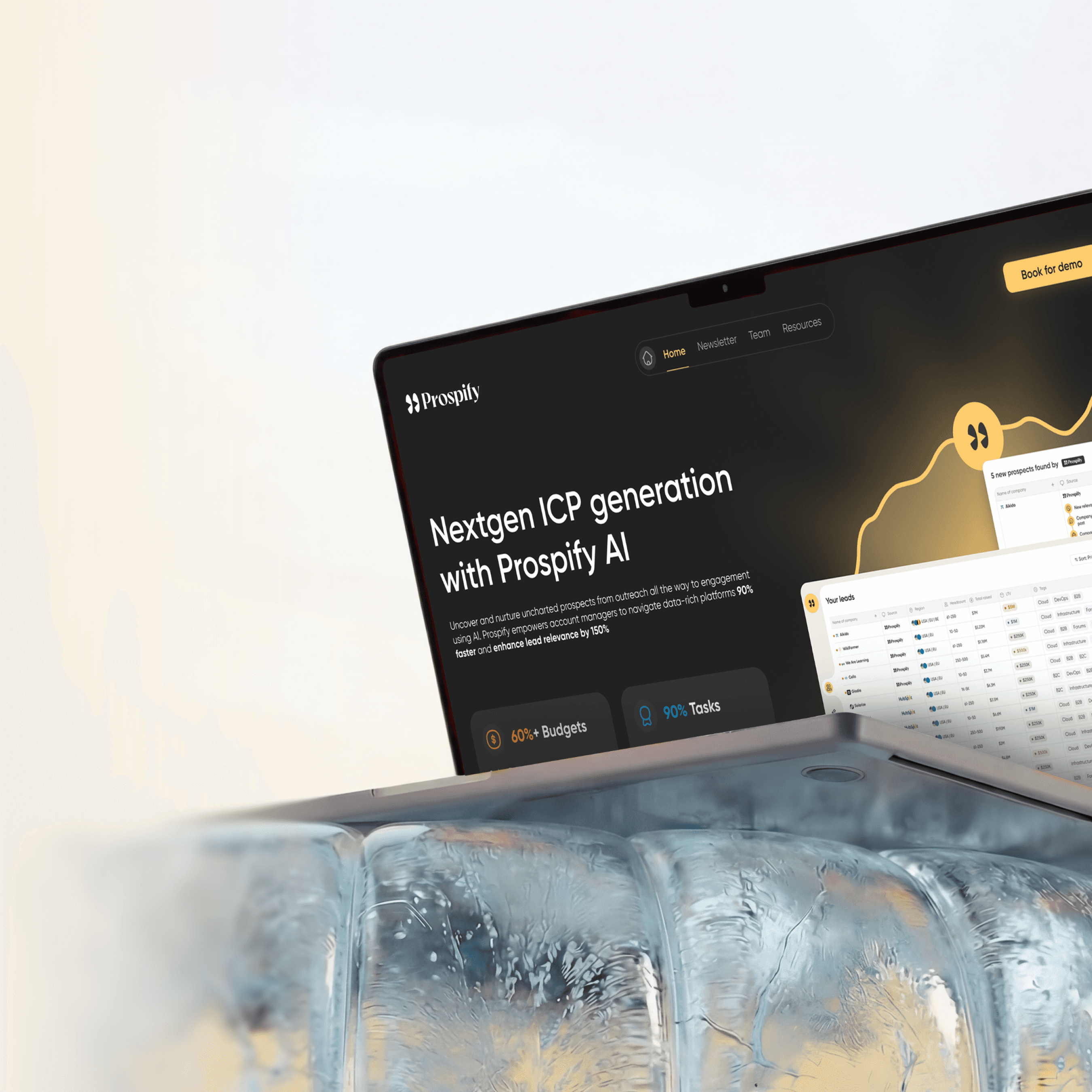
AI-powered B2B lead generation platform. From concept to launch.
Designed UI/UX from scratch for an AI platform that automates B2B lead generation. Research with SDR teams, two rounds of user testing, full redesign of interface architecture. Conversion grew by 55%, time to first lead dropped by 62%, bounce rate down by 35%.
Challenge
Problems & solutions
1
Problem
The platform needed to serve both sales newcomers and experienced SDR teams. Beginners required simplicity and quick start, while professionals wanted deep filter customization and advanced analytics.
1
Solution
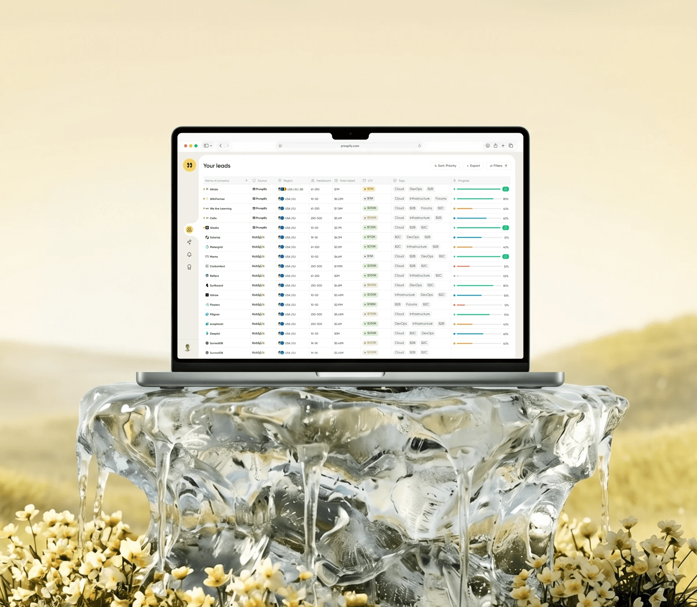
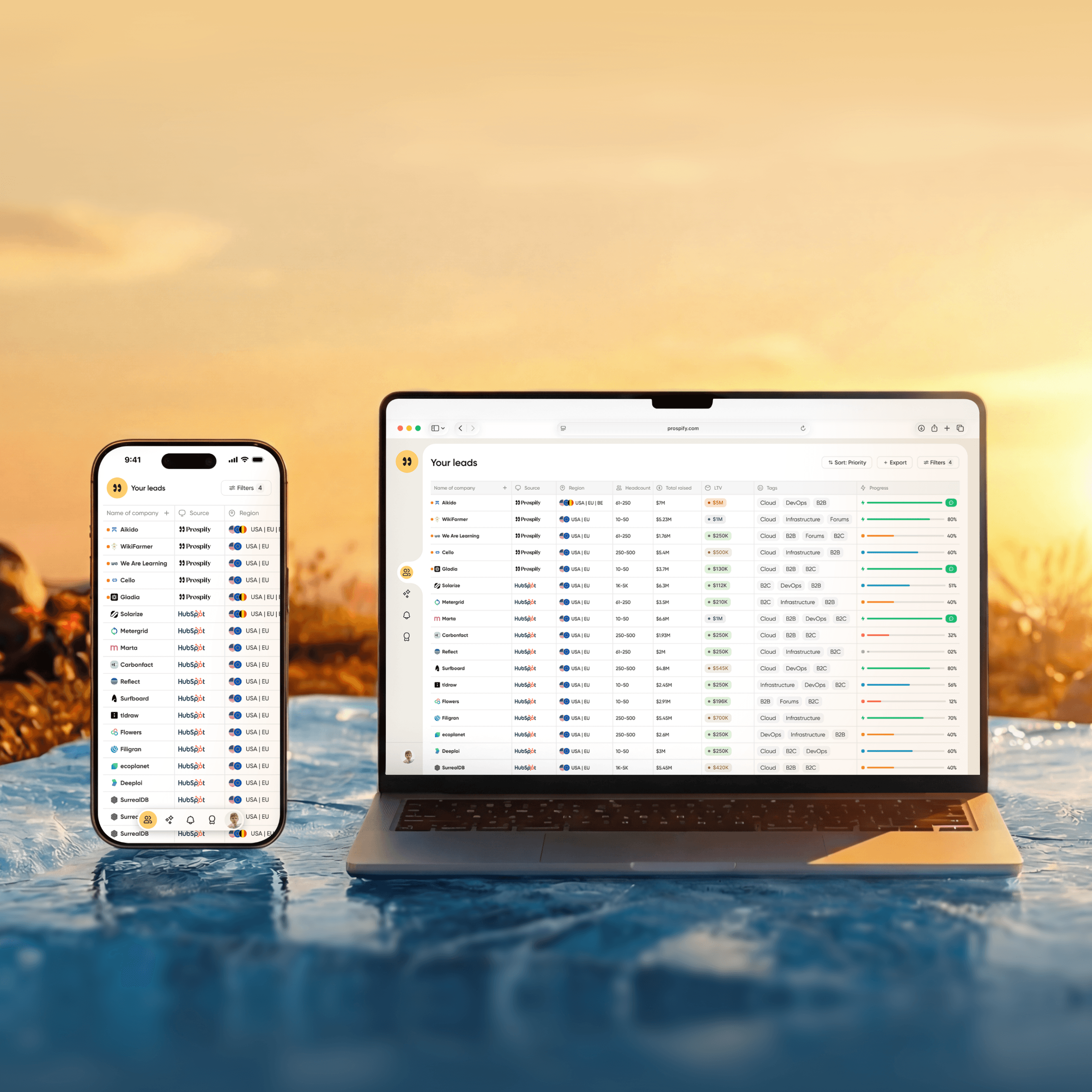
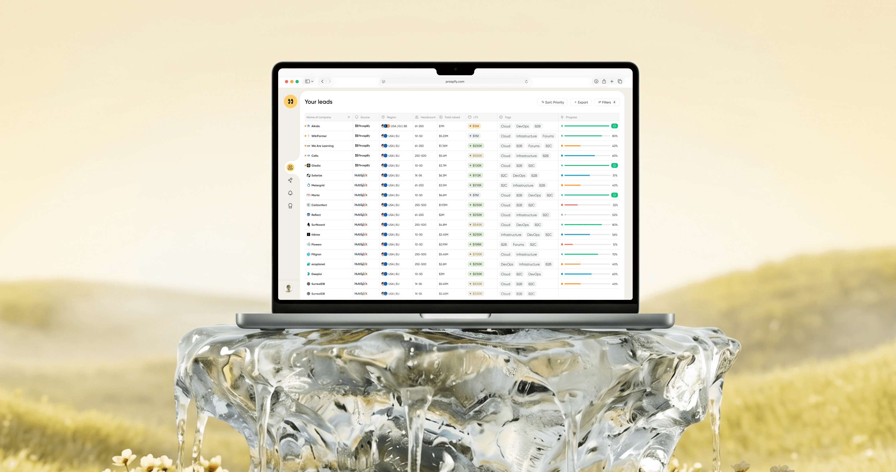
Simplified the interface for all levels. All critical information in one table - funding, LTV, progress, tags. Experienced SDRs don't need to open 5 screens for analysis. Newcomers understand priorities through visual indicators. Advanced filters accessible with one click.
2
Problem
New product in a crowded market. Conducted custdev and found that competitors' automation doesn't replace manual work. Initially designed the interface as an AI chat, but realized it doesn't work. People come for leads, not conversations with a bot.
2
Solution
Redesigned the architecture - removed chat from the forefront and made the leads table the main screen. AI works in the background, filling the table automatically. Chat remained as an ICP setup tool, but users immediately see the result - ready leads. Value is clear from the first second.
3
Problem
AI needs to work fast, but sales teams want to control selection parameters. Too simple interface limits professionals. Too complex scares away beginners. Need balance without screen overload.
3
Solution
Designed the interface together with experienced SDR teams, and tested on beginners and small teams. Hid advanced features that professionals need, but kept quick access to them. Result - experienced users got the control they need, beginners got a clean interface without overload.
Research
Research process
Started working on the product without any documentation. Studied competitor systems and interviewed their users to understand real work challenges. Results of this research became the foundation for the first documentation and Prospify design strategy.
Custdev & Audience Analysis
Conducted a series of interviews with SDR teams and solo founders. Identified the main pain point - competitors' automation doesn't replace manual work. Discovered a wide range in user experience - from sales beginners to professional teams.
Competitive Analysis
Studied top lead generation platforms (Apollo, Uplead, LinkedIn Sales Navigator) and their users. Found that all require manual setup and lengthy onboarding. Proposed "instant results" concept - AI automatically fills leads without configuration.
Iterations & Testing
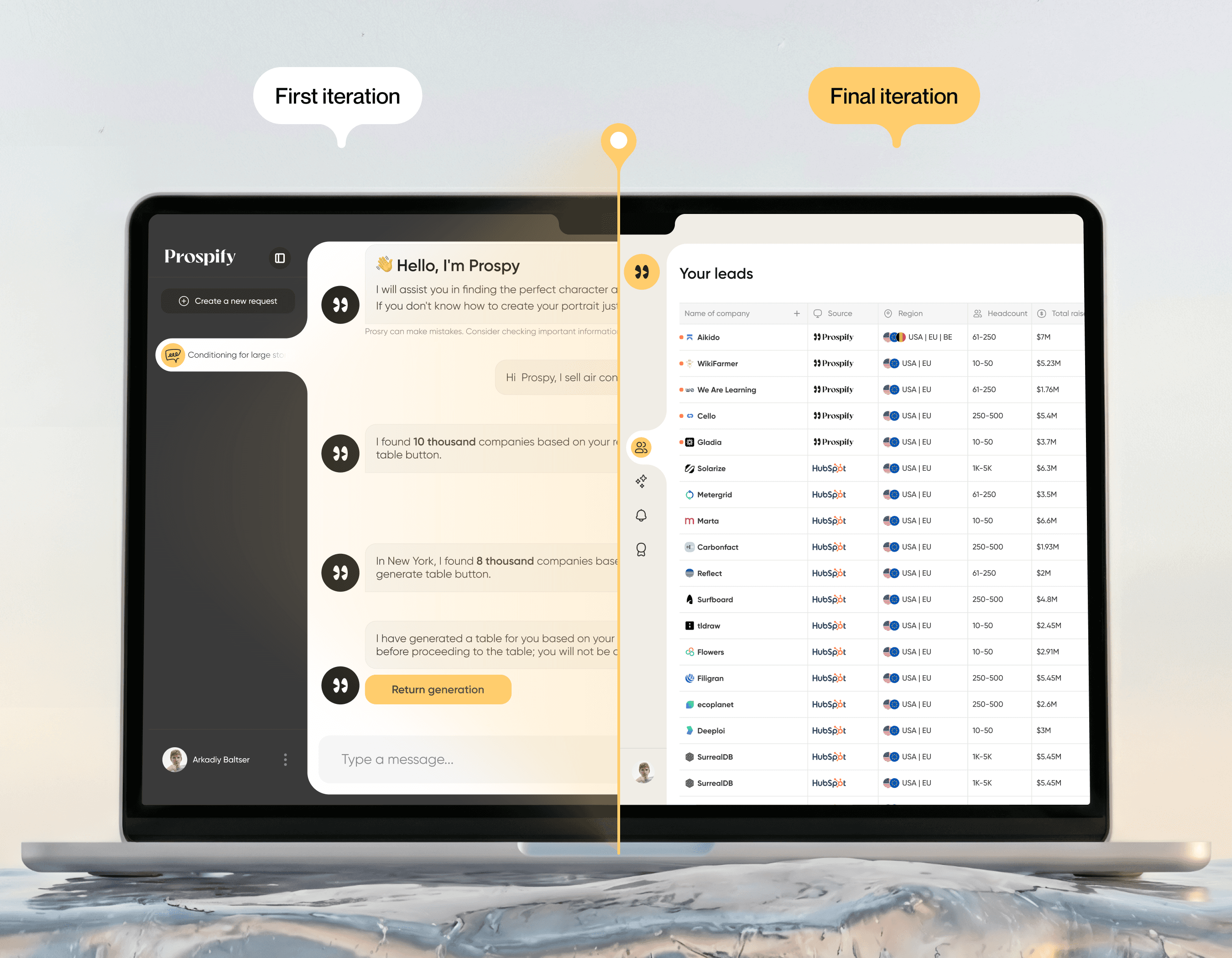
Developed two interface versions. First - chat in the forefront, second - leads table as the main screen. Tested on experienced SDRs and beginners. Second version showed 55% conversion growth - users immediately saw the product value.
Design Process
Product design
Intro paragraph: The design went through two iterations with a fundamental shift in approach. The first version focused on AI chat, but testing showed it distracted from the goal.
Strategy Shift: From Chat-First to Results-First design. Users come for leads, not conversations with a bot. Made the dashboard the main screen, AI works in the background - automatically creates ICP and fills the table with leads.
ICP Automation Through Design: User describes ICP in chat, AI optimizes the profile and fills the dashboard. Added visualization of optimization progress and lead progress indicators. Result - ready leads without manual setup.
Final statement: The platform became results-centric - focus on finding leads through automated ICP, without distractions.
Foundation
Design system
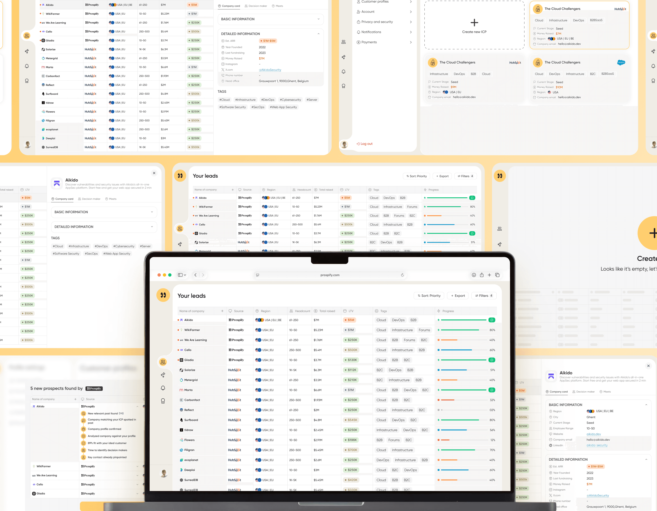
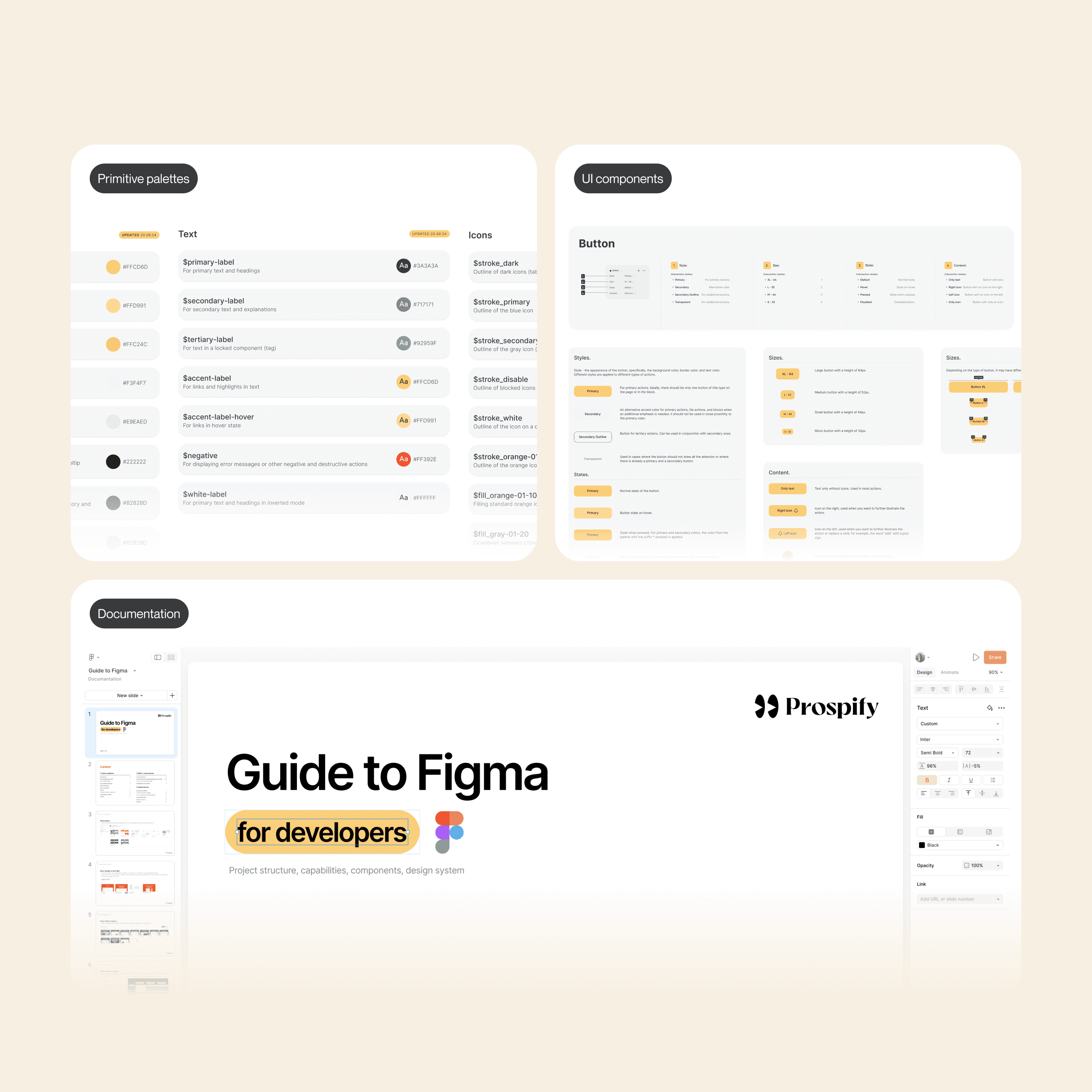
Intro paragraph: Created a design system from scratch for scalable product development.
First Iteration: Core System Built the foundation - color palette, typography, icons, and core usage principles. Defined guidelines for future platform growth and interface consistency.
Second Iteration: Component Library Developed a complete component library - tables, cards, filters, progress indicators, forms. Each component is documented with state variants and usage guidelines.
Result: Developers assemble basic screens independently for quick usability testing without waiting for the UX designer. Team works with ready-made patterns. Interface remains consistent when adding features, iteration speed increased.
Первый баннер
AI-powered B2B lead generation platform. From concept to launch.
AI-powered B2B lead generation platform. From concept to launch.
Текст первого баннера на странице
Designed UI/UX from scratch for an AI platform that automates B2B lead generation. Research with SDR teams, two rounds of user testing, full redesign of interface architecture. Conversion grew by 55%, time to first lead dropped by 62%, bounce rate down by 35%.
Challenge
Problems & solutions
Problems & solutions
1
Problem
Each bank wants its own set of services - from operations to investments and insurance. How to create a system for quickly assembling an app for each bank's unique requirements while maintaining UX quality? Without flexibility, banks won't buy the product, but complex customization will slow down launch.
The platform needed to serve both sales newcomers and experienced SDR teams. Beginners required simplicity and quick start, while professionals wanted deep filter customization and advanced analytics.
1
Solution
Built a modular design system with ready-made solution blocks and components for each service. We select needed blocks (cards, transfers, investments) and quickly customize them to the bank's brand. Each block contains tested logic and UX patterns. The bank gets a ready app without designing from scratch.
Simplified the interface for all levels. All critical information in one table - funding, LTV, progress, tags. Experienced SDRs don't need to open 5 screens for analysis. Newcomers understand priorities through visual indicators. Advanced filters accessible with one click.
2
Problem
Each bank has its own target audience by age - some work with youth, others with older clients, some with everyone. Young users want speed and modern interface, elderly want simplicity and clarity at each step. How to create one white-label solution that adapts to different age groups without redesigning?
New product in a crowded market. Conducted custdev and found that competitors' automation doesn't replace manual work. Initially designed the interface as an AI chat, but realized it doesn't work. People come for leads, not conversations with a bot.
2
Solution
Each bank has its own target audience by age - some work with youth, others with older clients, some with everyone. Young users want speed and modern interface, elderly want simplicity and clarity at each step. How to create one white-label solution that adapts to different age groups without redesigning?
Redesigned the architecture - removed chat from the forefront and made the leads table the main screen. AI works in the background, filling the table automatically. Chat remained as an ICP setup tool, but users immediately see the result - ready leads. Value is clear from the first second.
3
Problem
White-label solution is sold to banks, not directly to end users. How to test app usability without access to real bank clients? Can't just release MVP and collect feedback - banks buy a ready product. UX errors will be discovered only after implementation, when fixes are expensive and time-consuming.
AI needs to work fast, but sales teams want to control selection parameters. Too simple interface limits professionals. Too complex scares away beginners. Need balance without screen overload.
3
Solution
Conducted testing at three levels. First - with bank employees who know client requests. Second - interviews with real clients of different banks, identified common problems. Third - focus group of different ages and audit by UX experts. This allowed testing the solution before implementation and avoiding expensive fixes.
Designed the interface together with experienced SDR teams, and tested on beginners and small teams. Hid advanced features that professionals need, but kept quick access to them. Result - experienced users got the control they need, beginners got a clean interface without overload.
Research
Research process
Research process
Started by studying previous documentation - it described user problems and the history of all iterations.
Tracked changes in each iteration to understand which solutions worked and which didn't. This helped avoid repeating mistakes and build a redesign strategy based on real experience from previous versions.
Started working on the product without any documentation. Studied competitor systems and interviewed their users to understand real work challenges. Results of this research became the foundation for the first documentation and Prospify design strategy.
Product & Service Audit
Custdev & Audience Analysis
Analyzed financial products of different banks - from basic operations to investments and insurance. Identified common patterns and unique requirements of each bank. This determined the architecture of the modular system.
Conducted a series of interviews with SDR teams and solo founders. Identified the main pain point - competitors' automation doesn't replace manual work. Discovered a wide range in user experience - from sales beginners to professional teams.
Product & Service Audit
Competitive Analysis
Tested the interface with users of different age groups (from 18 to 70+ years). Identified which patterns work universally and where adaptation is needed. Studied popular apps in the country to use familiar patterns.
Studied top lead generation platforms (Apollo, Uplead, LinkedIn Sales Navigator) and their users. Found that all require manual setup and lengthy onboarding. Proposed "instant results" concept - AI automatically fills leads without configuration.
Iterative Prototyping
Iterations & Testing
Created a series of prototypes with different modularity approaches. Tested with business units of bank clients, demonstrated assembly speed for their requirements. Each iteration improved the balance between flexibility and implementation speed.
Developed two interface versions. First - chat in the forefront, second - leads table as the main screen. Tested on experienced SDRs and beginners. Second version showed 55% conversion growth - users immediately saw the product value.
Design Process
Product design
Product design
Intro paragraph: The design went through two iterations with a fundamental shift in approach. The first version focused on AI chat, but testing showed it distracted from the goal.
Strategy Shift: From Chat-First to Results-First design. Users come for leads, not conversations with a bot. Made the dashboard the main screen, AI works in the background - automatically creates ICP and fills the table with leads.
ICP Automation Through Design: User describes ICP in chat, AI optimizes the profile and fills the dashboard. Added visualization of optimization progress and lead progress indicators. Result - ready leads without manual setup.
Final statement: The platform became results-centric - focus on finding leads through automated ICP, without distractions.
Foundation
Design system
Design system
Intro paragraph: Created a design system from scratch for white-label solution, allowing banks to quickly customize the app to their brand.
First Iteration: Built the foundation - adaptive color palette for any brand, typography for all ages, icons, and usage principles. Defined consistency rules for any brand color.
Second Iteration: Developed a library of ready-made blocks for financial services - cards, transfers, investments, payments. Each block contains components and tested patterns. Blocks documented with assembly rules.
Result: Banks assemble the app from ready blocks in weeks instead of months. System adapts to any brand automatically. Interface remains consistent regardless of service set.
Intro paragraph: Created a design system from scratch for scalable product development.
First Iteration: Core System Built the foundation - color palette, typography, icons, and core usage principles. Defined guidelines for future platform growth and interface consistency.
Second Iteration: Component Library Developed a complete component library - tables, cards, filters, progress indicators, forms. Each component is documented with state variants and usage guidelines.
Result: Developers assemble basic screens independently for quick usability testing without waiting for the UX designer. Team works with ready-made patterns. Interface remains consistent when adding features, iteration speed increased.
More work
GIGY — SaaS Booking System for Telegram
2024
Product Design & Engineering
White-Label Mobile Banking App
2025
#SaaS #Fintech #Android App #Enterprise Product #Redesign
Sledoput — Travel Booking Platform & Marketplace
2023
#Marketplace #End-to-End Design #Design System #Web
Prospify — AI-Powered B2B Lead Generation Platform
2025
#SaaS #AI Product #B2B #End-to-End Design