Client
Loominote AI
Year
2026
Timeline
8 weeks
Services
#AI Product #iOS #Redesign #UX Audit #Mobile App
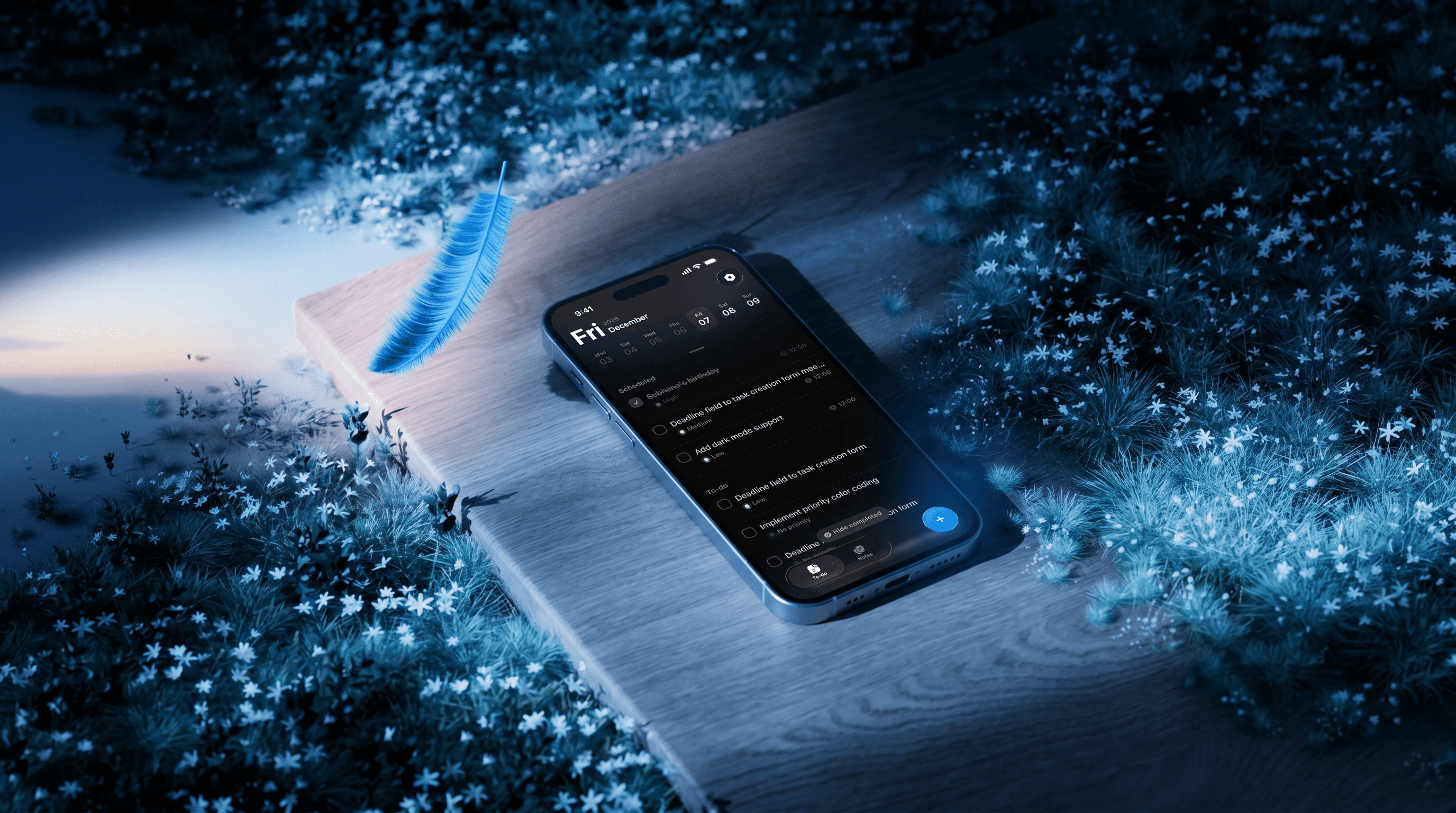
Loominote AI — a voice task and smart notes app that was losing users before they even started
Full redesign of an iOS app for voice-first tasks and notes. Paid subscription conversion grew from 18% to 57%.
Challenge
Problems & solutions
1
Problem
The product was built around features, not the user. The logic was clear to the developer and founder, but not to those opening the app for the first time.
1
Solution
We conducted a UX audit, convened a focus group, and documented all user dropouts. Then, we completely redesigned the UX design from scratch.
2
Problem
Users didn't understand why they had to pay. Paywall didn't explain its value—the app was an expense, not a tool.
2
Solution
We redesigned the onboarding and paywall screens and conducted A/B testing. Conversion increased thanks to a clear UX and UI—users now understand the value before reaching the payment screen.
3
Problem
The founder considered the AI voice and mind maps to be the main selling points. A focus group showed the opposite—they were simply a convenience feature, not a reason to download.
3
Solution
We shifted the focus to the speed of task and note creation. Voice remained, but we added photo-based creation. The main USP changed: to capture thoughts quickly, by any means necessary.
Research
Research process
I didn't start with Figma. The first two weeks were purely observation and conversation.
I conducted an audit of the existing product and identified 23 points of user loss, from the first screen to payment. Together with the client, we assembled a focus group of 12 people: students, freelancers, middle managers—anyone who had used the app or could become a target user. Everyone was given a task: create a task by voice, find it in a week, pay for a subscription. No one completed the flow without stopping.
Three insights changed the entire approach: the first touchpoint with the product didn't explain what it was. After correcting this, users didn't understand how the product differed from similar products. And only then: voice input wasn't perceived as a unique selling point, but as the only available creation method. The payment screen was perceived as a barrier, not a value proposition.
Первый баннер
Loominote AI — a voice task and smart notes app that was losing users before they even started
Loominote AI — a voice task and smart notes app that was losing users before they even started
Текст первого баннера на странице
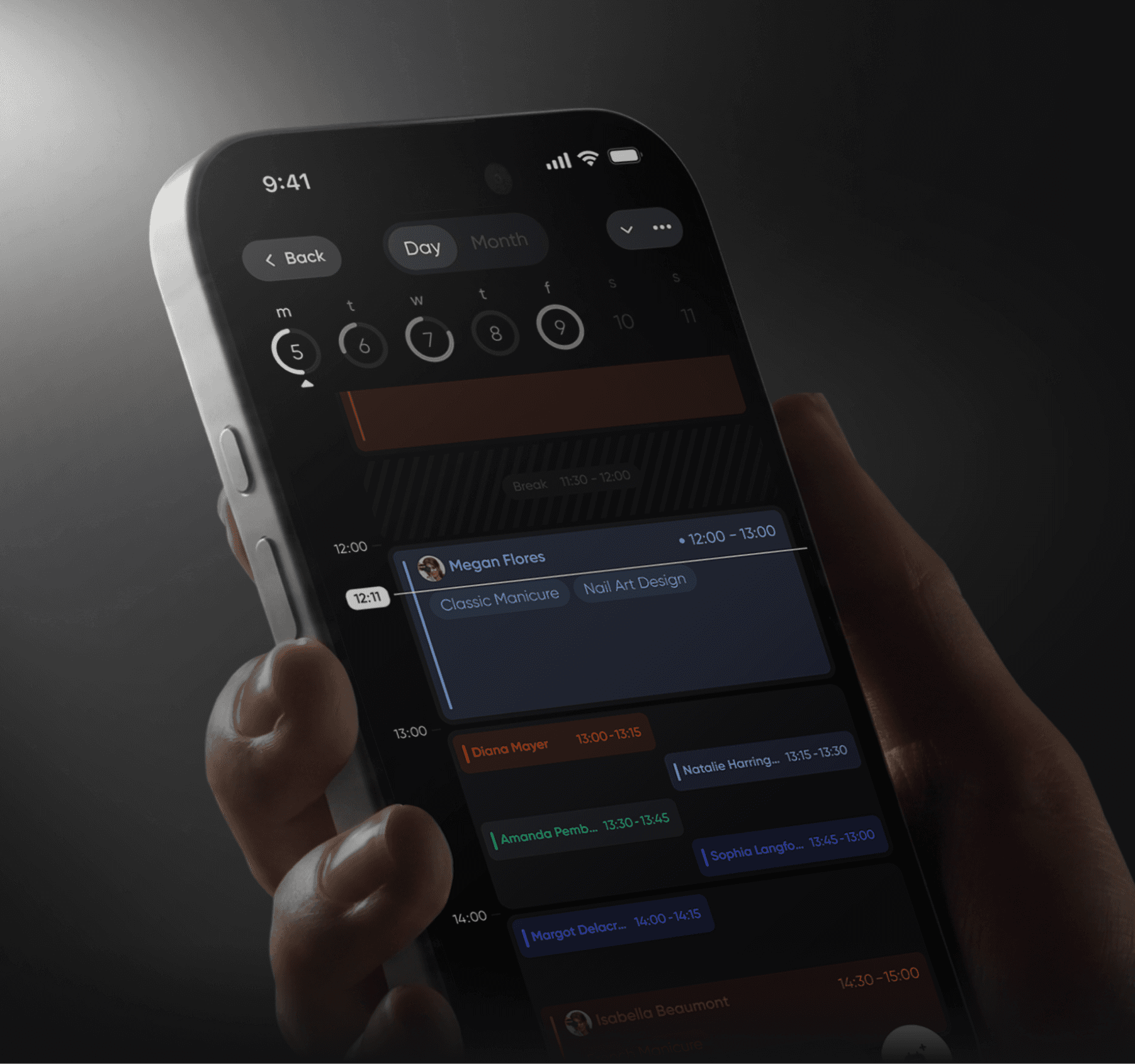
Full redesign of an iOS app for voice-first tasks and notes. Paid subscription conversion grew from 18% to 57%.
Challenge
Problems & solutions
Problems & solutions
1
Problem
Each bank wants its own set of services - from operations to investments and insurance. How to create a system for quickly assembling an app for each bank's unique requirements while maintaining UX quality? Without flexibility, banks won't buy the product, but complex customization will slow down launch.
The product was built around features, not the user. The logic was clear to the developer and founder, but not to those opening the app for the first time.
1
Solution
Built a modular design system with ready-made solution blocks and components for each service. We select needed blocks (cards, transfers, investments) and quickly customize them to the bank's brand. Each block contains tested logic and UX patterns. The bank gets a ready app without designing from scratch.
We conducted a UX audit, convened a focus group, and documented all user dropouts. Then, we completely redesigned the UX design from scratch.
2
Problem
Each bank has its own target audience by age - some work with youth, others with older clients, some with everyone. Young users want speed and modern interface, elderly want simplicity and clarity at each step. How to create one white-label solution that adapts to different age groups without redesigning?
Users didn't understand why they had to pay. Paywall didn't explain its value—the app was an expense, not a tool.
2
Solution
Each bank has its own target audience by age - some work with youth, others with older clients, some with everyone. Young users want speed and modern interface, elderly want simplicity and clarity at each step. How to create one white-label solution that adapts to different age groups without redesigning?
We redesigned the onboarding and paywall screens and conducted A/B testing. Conversion increased thanks to a clear UX and UI—users now understand the value before reaching the payment screen.
3
Problem
White-label solution is sold to banks, not directly to end users. How to test app usability without access to real bank clients? Can't just release MVP and collect feedback - banks buy a ready product. UX errors will be discovered only after implementation, when fixes are expensive and time-consuming.
The founder considered the AI voice and mind maps to be the main selling points. A focus group showed the opposite—they were simply a convenience feature, not a reason to download.
3
Solution
Conducted testing at three levels. First - with bank employees who know client requests. Second - interviews with real clients of different banks, identified common problems. Third - focus group of different ages and audit by UX experts. This allowed testing the solution before implementation and avoiding expensive fixes.
We shifted the focus to the speed of task and note creation. Voice remained, but we added photo-based creation. The main USP changed: to capture thoughts quickly, by any means necessary.
Второй баннер
I started with an audit, not with screens.
I started with an audit, not with screens.
Текст второго баннера на странице
Three reasons why the product wasn't converting.
Research
Research process
Research process
Started by studying previous documentation - it described user problems and the history of all iterations.
Tracked changes in each iteration to understand which solutions worked and which didn't. This helped avoid repeating mistakes and build a redesign strategy based on real experience from previous versions.
I didn't start with Figma. The first two weeks were purely observation and conversation.
I conducted an audit of the existing product and identified 23 points of user loss, from the first screen to payment. Together with the client, we assembled a focus group of 12 people: students, freelancers, middle managers—anyone who had used the app or could become a target user. Everyone was given a task: create a task by voice, find it in a week, pay for a subscription. No one completed the flow without stopping.
Three insights changed the entire approach: the first touchpoint with the product didn't explain what it was. After correcting this, users didn't understand how the product differed from similar products. And only then: voice input wasn't perceived as a unique selling point, but as the only available creation method. The payment screen was perceived as a barrier, not a value proposition.
I didn't start with Figma. The first two weeks were purely observation and conversation.
I conducted an audit of the existing product and identified 23 points of user loss, from the first screen to payment. Together with the client, we assembled a focus group of 12 people: students, freelancers, middle managers—anyone who had used the app or could become a target user. Everyone was given a task: create a task by voice, find it in a week, pay for a subscription. No one completed the flow without stopping.
Three insights changed the entire approach: the first touchpoint with the product didn't explain what it was. After correcting this, users didn't understand how the product differed from similar products. And only then: voice input wasn't perceived as a unique selling point, but as the only available creation method. The payment screen was perceived as a barrier, not a value proposition.
Третий баннер
I started with an audit, not with screens.
I started with an audit, not with screens.
Текст третьего баннера на странице
Three reasons why the product wasn't converting.
Шоурил
Onboarding
Onboarding
Текст для шоурила
Before redesigning the app — I started with onboarding. Completion rate grew from 8% to 52%. The client saw that the niche works — users just didn't understand the product.
Создание записи
Paywall
Paywall
Показать полный флоу создания записи от начала до конца — быстро и без лишних шагов. Акцент на том что запись создаётся в минимальное количество касаний.
The problem was in the price hierarchy — the annual total was shown large, the monthly breakdown small. Users saw $200 and left. I redesigned the entire paywall: structure, value presentation, and pricing logic. Conversion grew from 2% to 17%.
Тарифы
Hide completed
Hide completed
Показать переход из профиля в раздел тарифов. Экран тарифов должен выглядеть визуально сильно — это продающий экран продукта. Анимация перехода плавная и акцентированная.
Completed tasks stayed in the list and created visual noise. Users lost focus. I added the ability to hide completed tasks — priority stays on what matters now, history is never lost.
График работы Сценарий 1
Appstore
Appstore
Показать основной экран дашборда. Выходной день — переключение в рабочий. Появляются пустые слоты — постепенно заполняются разными клиентами. Появление уведомления о подтверждении записи внутри дашборда.
График работы Сценарий 2
Onboarding
Onboarding
Before redesigning the app — I started with onboarding. Completion rate grew from 8% to 52%. The client saw that the niche works — users just didn't understand the product.
Управление записью Сценарий 1
Homepage
Homepage
Расходники Показать список постоянных расходников. В примере использовать реальные позиции для колориста: перчатки, краска, окислитель. Показать как выбираем расходники и как меняется итоговая цена записи при выборе.
They completed onboarding, paid — and deleted the app. LTV was zero, no one came back for a second month. The home screen didn't explain how to use the product: unclear structure, broken navigation, a banner that got in the way. I redesigned the hierarchy — now more than half of paying users renew their subscription.
Управление записью Сценарий 2
Note editor
Note editor
The client thought that more buttons meant more visible features. In reality it was visual noise. Transcript, translation, editing — each action required going back and tapping again. I merged everything into one editor. Less choice — better product.
Настройка календаря Сценарий 1
Note editor
Note editor
График Показать экраны настройки рабочих дней: пн вт ср чт пт. Показать взаимодействие — включение и выключение дней, изменение рабочего времени.
The client thought that more buttons meant more visible features. In reality it was visual noise. Transcript, translation, editing — each action required going back and tapping again. I merged everything into one editor. Less choice — better product.
Настройка календаря Сценарий 2
Scan
Scan
Перерывы Настройка постоянного перерыва — добавление регулярного перерыва в расписание.
The feature was hidden, and after scanning — a blank screen with no feedback. Users closed the app thinking it had frozen. I made the feature accessible from the unified creation point and added a loading state — now the product explains what's happening under the hood.
Настройка календаря Сценарий 3
Voice recording
Voice recording
Перерыв в течении дня Уже в графике — постановка разового перерыва прямо в текущем рабочем дне.
Voice was the only way to create — the client saw it as an advantage. In practice it cut off everyone who found voice input inconvenient. I moved the recorder off the front stage and placed it alongside all other creation methods. Everyone finds what works for them — voice, text, scan or photo.
Геймификация Скролл навбара
Publish content
Publish content
Геймификация Показать микроанимации и UX решения. Анимация возврата на сегодня когда ушёл на 10 дней вперёд. Кнопка назад при скролле. Дополнительные элементы геймификации на усмотрение дизайнера на основе реальных экранов проекта.
A unique feature — from a note straight to social media. But it used to be a list of buttons all leading to the same action. I unified everything into one point — choose the format, AI adapts the content. A note becomes a post, an email or an article.
Геймификация Скролл дня
Mind map
Mind map
Геймификация Показать микроанимации и UX решения. Анимация возврата на сегодня когда ушёл на 10 дней вперёд. Кнопка назад при скролле. Дополнительные элементы геймификации на усмотрение дизайнера на основе реальных экранов проекта.
Геймификация Скролл дня
Results
Results
Геймификация Показать микроанимации и UX решения. Анимация возврата на сегодня когда ушёл на 10 дней вперёд. Кнопка назад при скролле. Дополнительные элементы геймификации на усмотрение дизайнера на основе реальных экранов проекта.
A product is built not on guesses — but on hypotheses that are validated with data. Every decision in this project went through audit, testing and measurement. You don't need to reinvent — you need to implement patterns that already work and that people already understand.
More work
GIGY — SaaS Booking System for Telegram
2024
Product Design & Engineering
White-Label Mobile Banking App
2025
#SaaS #Fintech #Android App #Enterprise Product #Redesign
Sledoput — Travel Booking Platform & Marketplace
2023
#Marketplace #End-to-End Design #Design System #Web
Prospify — AI-Powered B2B Lead Generation Platform
2025
#SaaS #AI Product #B2B #End-to-End Design